A 0→1 design system for e& (Etisalat) where every value — every colour, radius, spacing step — resolves from one Figma token export. The same file generates CSS, SwiftUI, and Compose tokens, so three platforms cannot drift. 46 components and 198 icons ship as one npm package.
e& (formerly Etisalat) is the UAE's largest telecom group, and its consumer app is the surface most of that customer base touches. The design language for it existed — a Figma library, DSL V1.1 — but it existed only in Figma. iOS built from screenshots. Android built from iOS. Web built from whatever was most recent. Three teams, three interpretations, one brand.
The specific failure mode wasn't "the button looks slightly wrong." It was that every value in the product — every red, every radius, every 12px gap — had three sources of truth, and no mechanism to make them agree. A token change in Figma had to be manually retyped into three codebases by three people who would each round it differently. Drift wasn't a risk; it was the steady state.
So the brief I set for myself wasn't "document the design system." It was: make the system installable. If a developer can npm install it, the argument about whether to adopt it stops being a conversation.
┌───────────────────────────────────────────────────────────┐
│              FIGMA DSL V1.1 LIBRARY                       │
│              ┌──────────────────┐                         │
│              │  variables.json   │ ← single source        │
│              └────────┬──────────┘                         │
│                      │                                     │
│         ┌────────────┼────────────┐                       │
│         ▾            ▾            ▾                       │
│  ┌────────────┐ ┌──────────┐ ┌────────────┐              │
│  │  CSS Vars  │ │ SwiftUI  │ │  Compose   │              │
│  │  (Web)     │ │ (iOS)    │ │  (Android) │              │
│  └─────┬──────┘ └────┬─────┘ └─────┬──────┘              │
│        │             │             │                      │
│        ▾             ▾             ▾                      │
│  ┌──────────────────────────────────────────────────┐     │
│  │  @eand/react-design-system  (npm package)       │     │
│  │  46 components · 198 icons (396 w/ filled)      │     │
│  └──────────────────────────────────────────────────┘     │
│        │                                                  │
│        ▾                                                  │
│  ┌──────────────────────────────────────────────────┐     │
│  │  Docs Site — live demos + SwiftUI/Compose/React │     │
│  │  code gen · Figma Make kit compatibility         │     │
│  └──────────────────────────────────────────────────┘     │
└───────────────────────────────────────────────────────────┘
The whole architecture hangs off one decision: a single token source. Every colour, type step, spacing value, and radius resolves from `variables.json`, exported straight out of the Figma DSL V1.1 library. That same file is what generates the SwiftUI and Compose token sets. There is no second place to change a value, which means there is no way for the platforms to disagree.
On top of the primitives I layered semantic tokens — `surface/*`, `text/*`, `border/*`, `button/*`, `status/*`. Product code never reaches for `midnight/1000` or `#e00800`; it asks for `text.brandDefault` and gets whatever that currently means. The primitive ramps stay underneath as the raw material. This is the layer that lets the brand re-theme without touching a single screen.
Typography had a constraint most systems don't: the product is bilingual. The Latin ramp is built for Suisse Int'l; the Arabic/RTL ramp runs parallel on the same steps with tuned metrics, so `body.md` means the same thing in both directions and a layout doesn't reflow when the language flips. The font is licensed, so the package ships a fallback stack rather than pretending to bundle it.
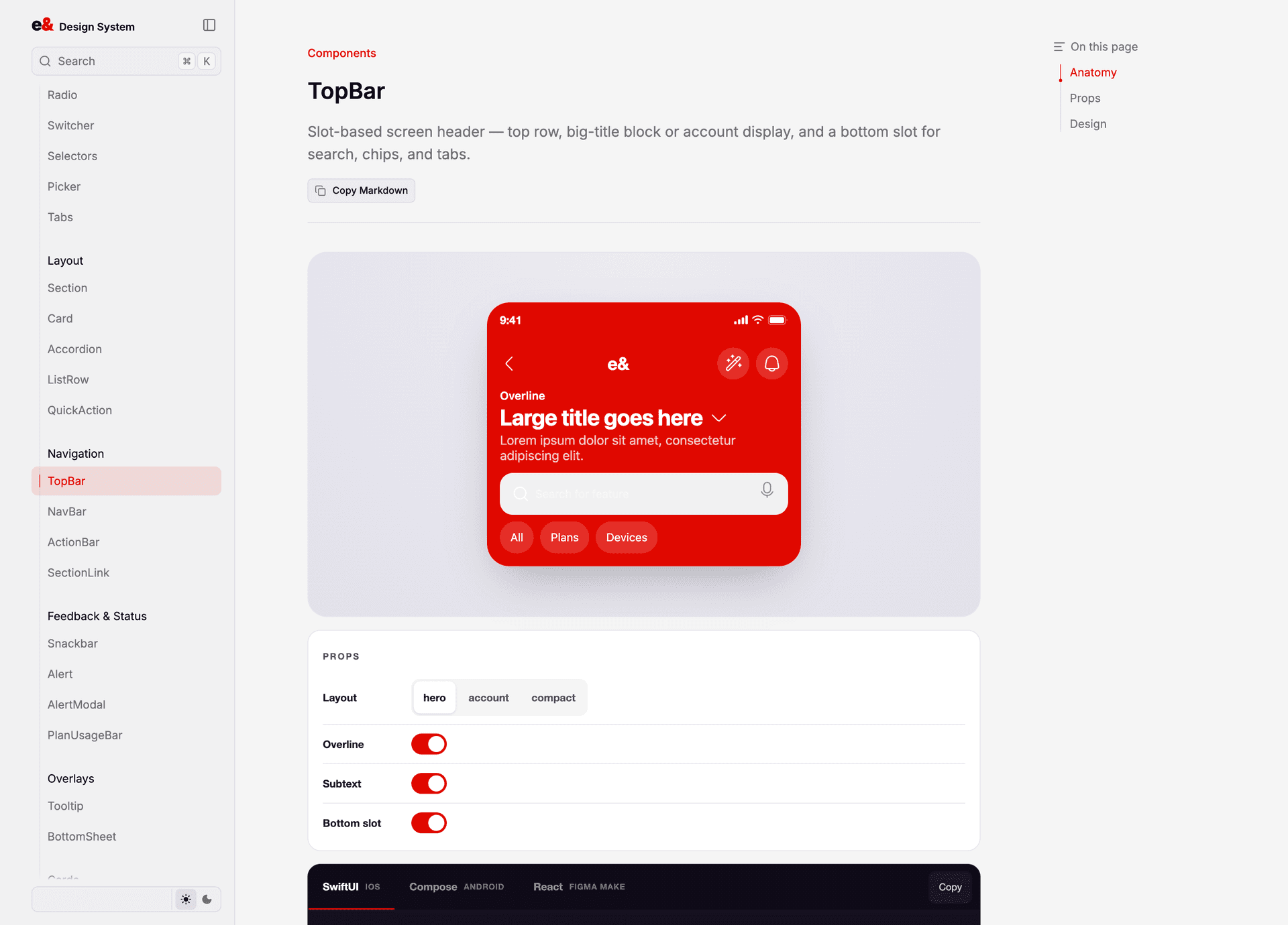
The components are where the system stops being a theory. 46 of them — TopBar, PlanCard, BottomSheet, Stepper, the lot — designed as slot-based APIs rather than variant enums. TopBar takes a `surface`, an `account`, and children; you compose a search field or tabs or chips into the bottom slot instead of waiting for me to add a variant for it. When I refactored that API, the old `variant` / `greeting` / `actionBar` props stayed in as back-compat aliases, because a system that breaks its consumers on a minor version teaches them not to upgrade.
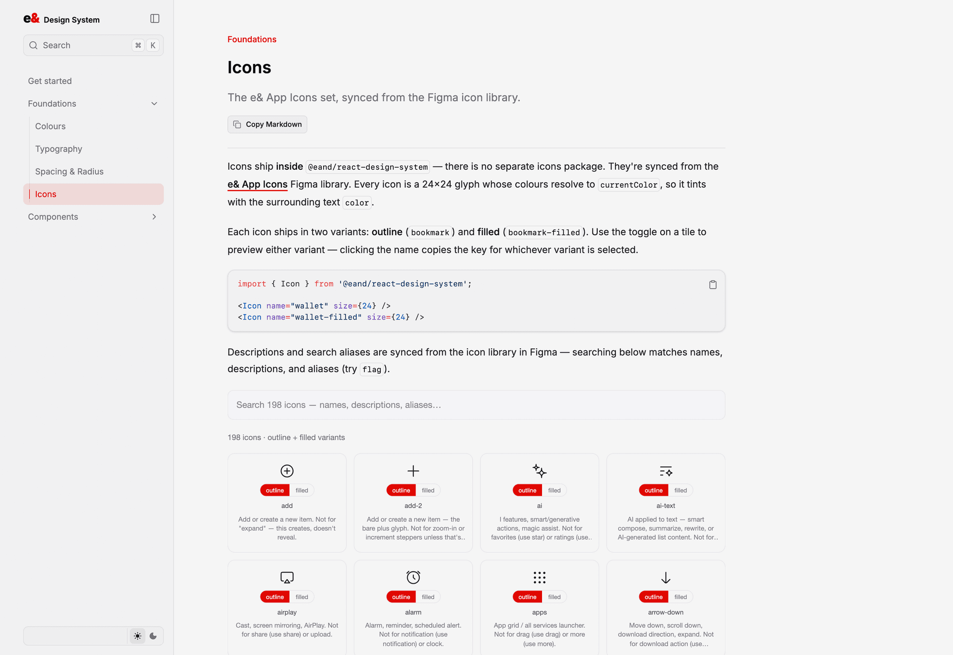
Icons ship inside the same package — 198 base glyphs, each in outline and filled, 396 total. No separate icons dependency to version-skew against. They're 24×24, they resolve to `currentColor` so they inherit text colour, and they carry the descriptions and search aliases synced from the Figma library, so someone hunting for "flag" finds it without knowing the internal name.
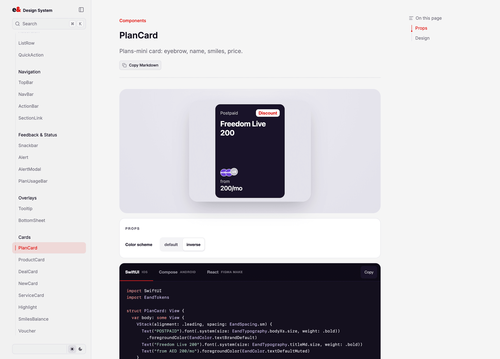
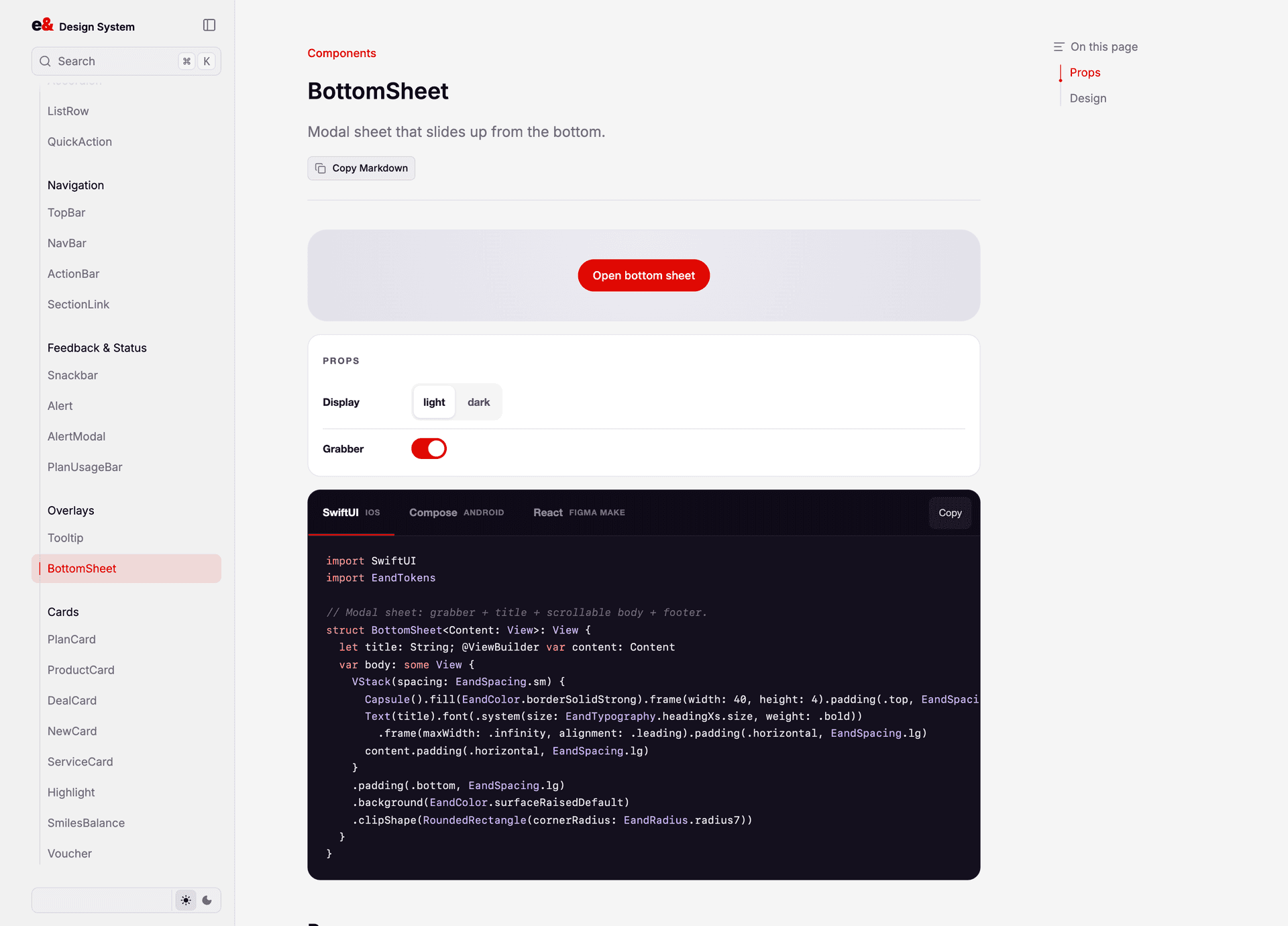
Then the docs site, which is the part I care about most. Not a Storybook install — a purpose-built site where every component page has a live demo you drive with real knobs, a prop table, anatomy notes, design rationale, and the generated code in SwiftUI, Compose, and React side by side. An iOS engineer lands on the TopBar page and copies SwiftUI. An Android engineer copies Compose. Neither has to talk to me first.
The last piece was Figma Make. The published package doubles as a Make kit — register it and Make assembles e& screens out of these exact components, not out of generic rectangles. That needed more than the package: it needed a written guidelines file teaching Make how the system composes. Shipping the components without those rules gets you e&-coloured slop.
- CONTRIBUTIONS
- —Built the token pipeline: one Figma variable export → CSS custom properties, SwiftUI, and Compose
- —Designed and shipped 45 components and 198 icons (396 with filled variants) as @eand/react-design-system
- —Wrote the docs site — live knob-driven demos, prop tables, and per-platform code for every component
- —Defined semantic token layers (surface / text / border / button / status) over the raw primitive ramps
- —Shipped a bilingual type system — Suisse Int'l Latin ramp with a parallel Arabic/RTL ramp on matched steps
- —Packaged the system as a Figma Make kit so Make assembles real e& screens from the same components
The handoff document mostly stopped needing to exist, because the thing being handed off became a dependency instead of a PDF.
Installable, not documented
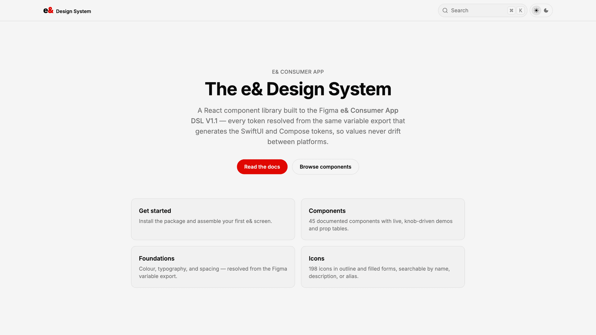
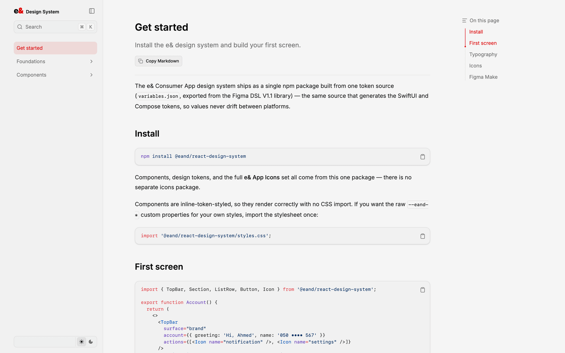
The front door states the contract: one npm package, one token source, and the same values the SwiftUI and Compose exports read. The Get started page gets an engineer from nothing to a rendered e& screen in one install and one import — no CSS setup, no separate icons dependency.
Foundations — one source, three platforms
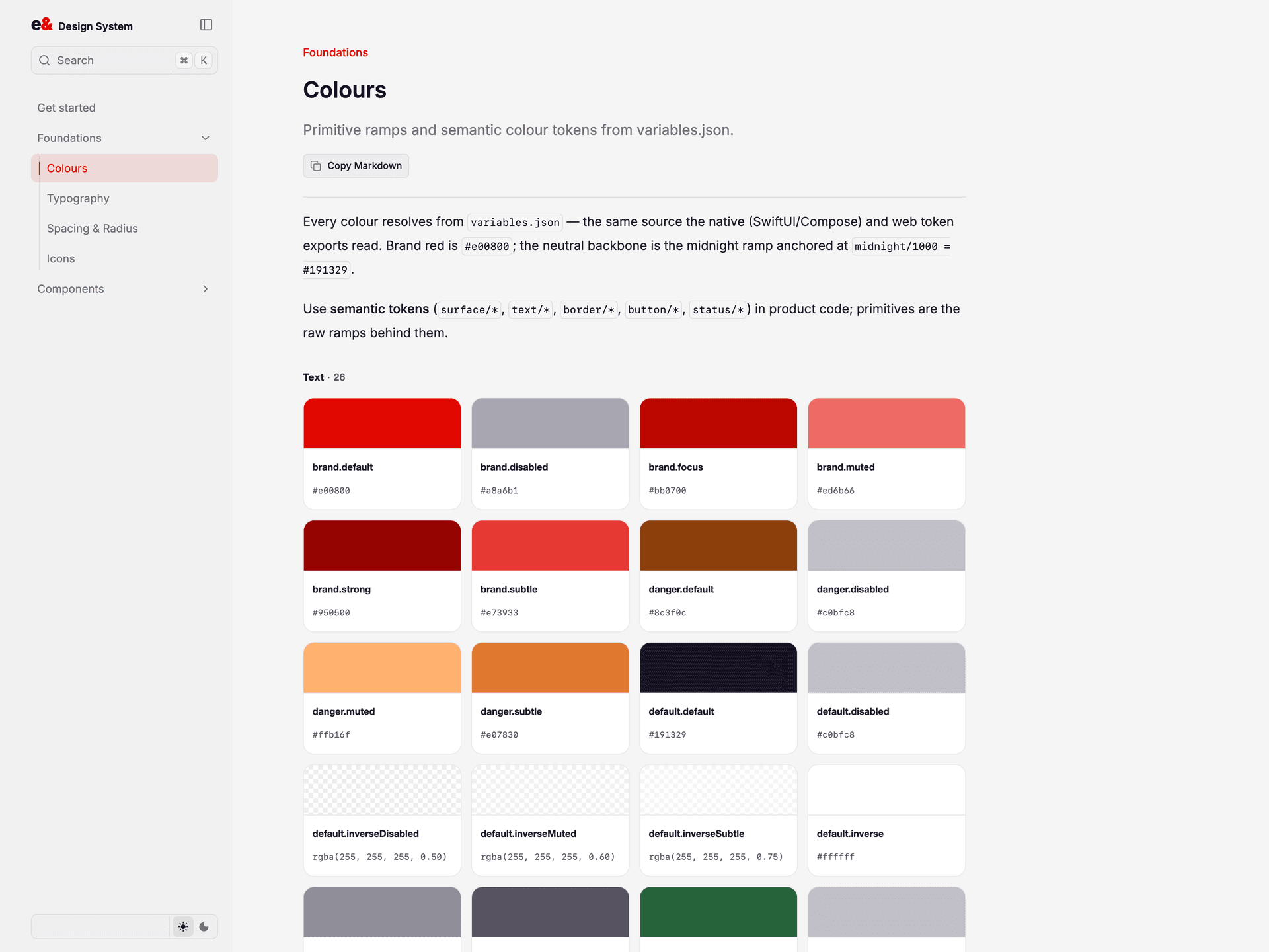
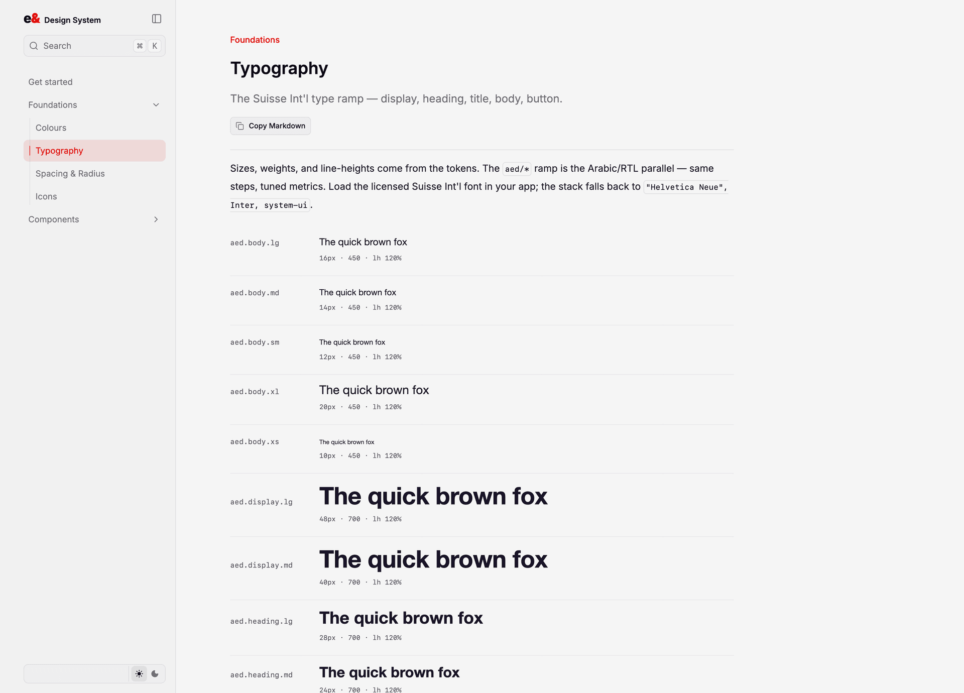
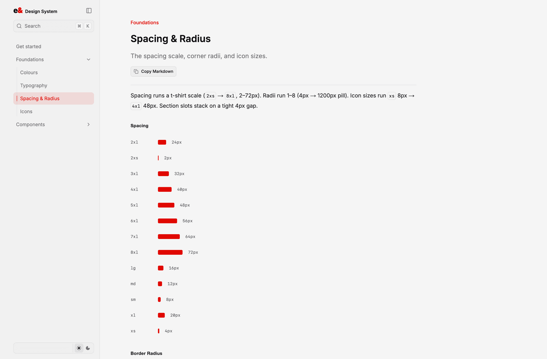
Every value resolves from the Figma variable export. Colour is split into primitive ramps and the semantic tokens product code actually uses. Type runs a Latin ramp and a matched Arabic/RTL ramp. Spacing is a t-shirt scale, 2px to 72px, with radii that terminate in a 1200px pill.
Components you can drive
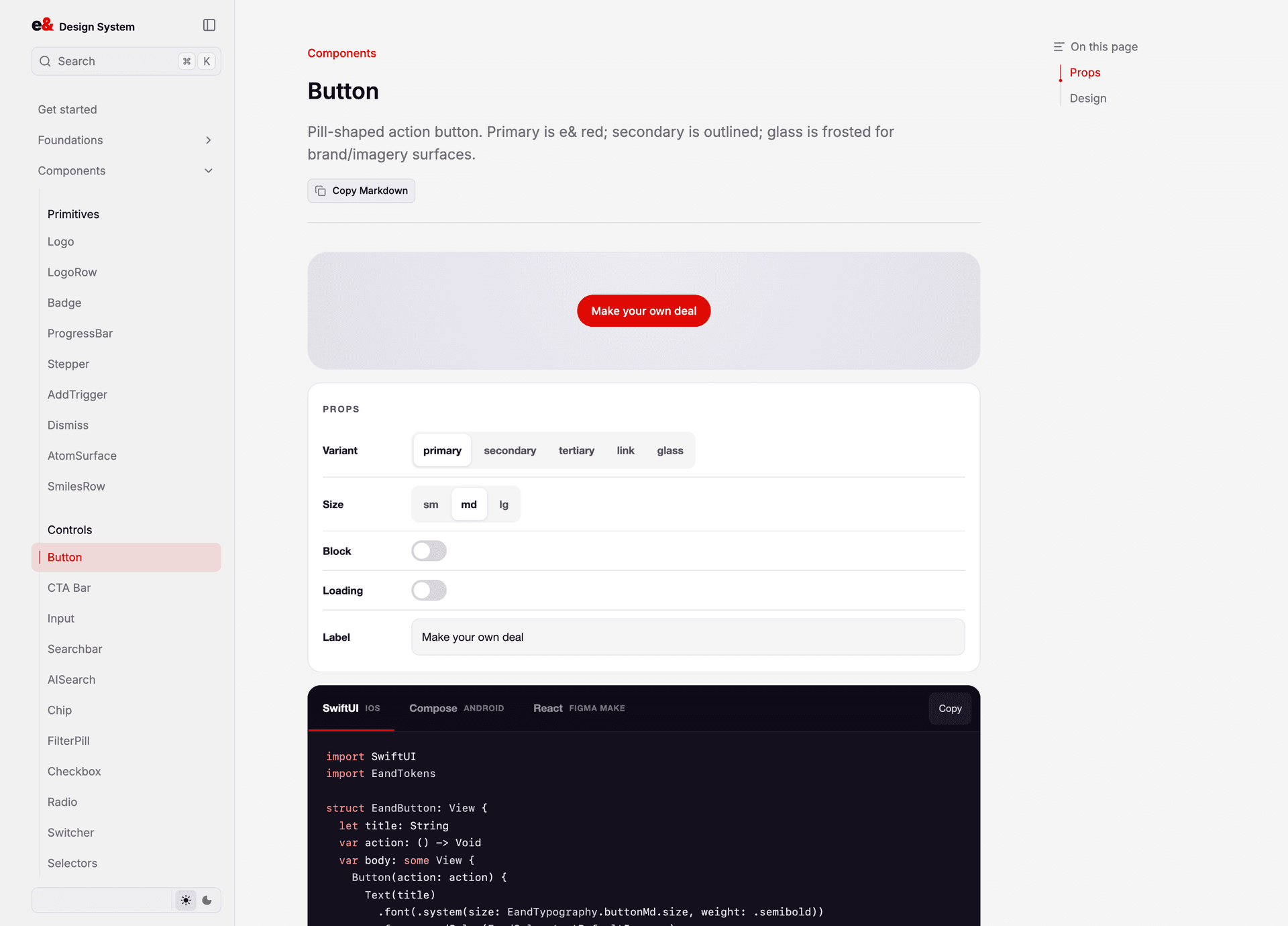
Every component page is a live demo with real knobs, not a static screenshot. Flip a prop and the component re-renders; the code block below it regenerates in SwiftUI, Compose, and React. That last part is the whole point — an iOS engineer never has to translate a web example into Swift by eye.
The system is live and browsable at eand-dsl.vercel.app — 46 documented components, 198 icons, foundations for colour, typography, spacing, and radius, all resolved from the same token export that feeds the native platforms. It installs with one line: `npm install @eand/react-design-system`.
The measurable change is where design decisions now live. Before, a token change meant three tickets across three codebases and a week of drift. Now it's one export, and iOS, Android, and web pick up the same value. The handoff document — the artefact this industry keeps trying to perfect — mostly stopped needing to exist, because the thing being handed off became a dependency instead of a PDF.
This is also the clearest answer I have to what I actually do. Every claim on this page is checkable in about thirty seconds: open the site, hit a component, drive the knobs, read the generated Swift.